In digital music distribution, the video thumbnail serves as the ultimate billboard: a single 16:9 frame tasked with translating sonic energy into immediate clicks. The visual curation across top-charting Afrobeats releases reveals a distinct evolution from generic luxury tropes toward high-concept, auteur-driven visual marketing. AkweyaTV has studied current trends across major 2026 Afrobeats hits and brings you key attributes you never noticed.
- High-Contrast Lighting and Neo-Noir Colour Palettes
- Low-Key Atmosphere
- Cinematic Depth
- Star Power and Dynamic Framing Archetypes
- Direct Gaze & Central Framing
- Collaborative Balance
- Maximalist World-Building
- Texture, Movement, and Cinematic Visualisers
- The Bold, Textless Beauty Powering Modern Afrobeats
- Industry Rules and Platform Factors Behind These Choices
- 1. Vevo and Label Distribution Standards
- 2. UI Clutter and Redundancy on Mobile
- 3. “Cinema” vs. “Creator Economy” Signifiers
- 4. Global Cross-Border Portability
- The Packaging of Global Afrobeats in 2026
High-Contrast Lighting and Neo-Noir Colour Palettes
The prevalent aesthetic pivots away from flat, over-saturated daytime setups toward moody, high-contrast chiaroscuro and atmospheric neon saturation.
Low-Key Atmosphere
Projects like Victony’s SLICK, Seyi Vibez’s GTA, and FOLA’s fine ting utilise deep shadows punctuated by sharp rim lighting and rich blues or rain-soaked metallics.

Cinematic Depth
Rather than relying on uniform exposure, directors deploy dark tones to create visual separation, drawing the eye toward reflective jewelry, high-gloss textures, and facial contours.
Star Power and Dynamic Framing Archetypes
Thumbnail composition heavily dictates audience engagement by balancing personal brand power with cinematic narrative cues.
Direct Gaze & Central Framing
Standalone portraits (such as Asake’s Forgiveness or Young Jonn’s Elumelu) leverage extreme intimacy or playful fourth-wall breaks, anchoring the viewer’s attention directly on the artist’s persona.

Collaborative Balance
Two-artist setups (seen in BNXN & Sarz’s Back Outside and Darkoo & Asake’s That Girl) favour symmetrical mid-shots where both acts share equal visual weight, signaling high-value star crossovers.
Maximalist World-Building
Group scenes like Rema’s TEA and the multi-artist lineup in I Know Who… build dense, layered frames that tease larger narrative spectacle and cultural celebration.
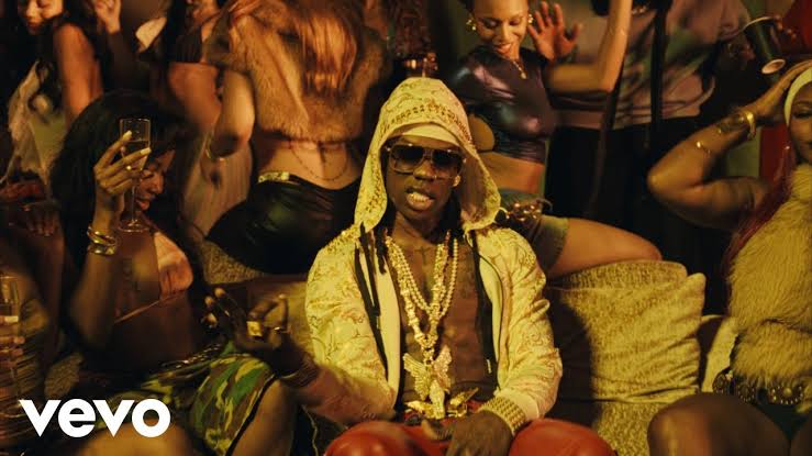
Texture, Movement, and Cinematic Visualisers
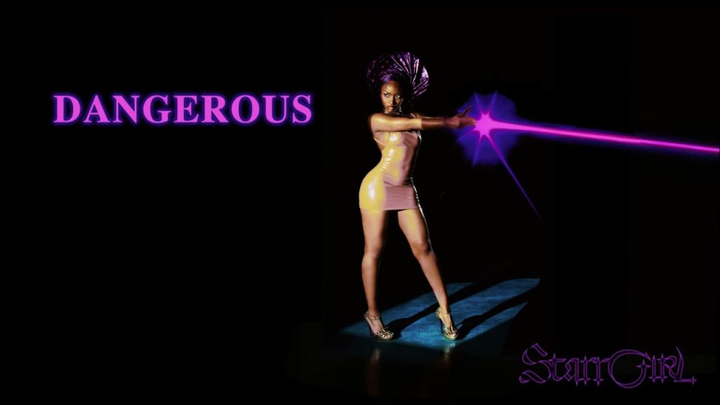
Rather than treating visualisers as static album-art placeholders, releases such as Ayra Starr’s Dangerous and Treasure adopt retro-futuristic laser aesthetics, high-gloss typography, and performance silhouettes. Across full music video stills, physical props, such as custom sports cars, vintage motorcycles, structured fur coats, and high-fashion streetwear, act as focal anchors that communicate scale, prestige, and subcultural identity.
The Bold, Textless Beauty Powering Modern Afrobeats
A notable pattern across these Afrobeats thumbnails is the near-total absence of text overlays on official music videos, contrasted with selective typography on visualisers and lyric releases.
Observations on Thumbnail Typography
Clean Cinematic Stills
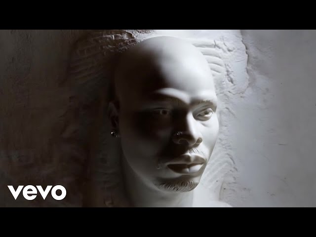
For official music videos (Asake, Davido, BNXN, Seyi Vibez), the thumbnail is almost exclusively a clean, colour-graded cinematic still with zero song titles or artist names added.
The Visualiser Exception
Text only appears prominently in non-traditional video formats such as Ayra Starr’s Dangerous and Treasure (stylised retro title cards) or DJ Maphorisa’s MONEY CONSTANT (album art/graphic typography).
The Vevo Watermark
The only consistent graphic element across the majority of these frames is the distributor watermark in the lower-left corner.
Industry Rules and Platform Factors Behind These Choices
AkweyaTV research revealed that these design choices were actual choices based on a number of factors.
1. Vevo and Label Distribution Standards
Major music distributors and aggregators (such as Vevo, Sony, and Universal) enforce strict delivery specifications for official music videos. Vevo guidelines explicitly advise against text overlays, logos, or artificial borders on official video thumbnails to maintain a uniform, television-grade standard across syndicated platforms and streaming hubs.
2. UI Clutter and Redundancy on Mobile

Because over 80% of YouTube music streaming occurs on mobile screens, adding title text directly into a 16:9 thumbnail creates visual clutter. The YouTube interface already displays the artist name, song title, and channel badge directly beneath the image in high-contrast native text. Adding typography inside the thumbnail wastes valuable visual real estate.
3. “Cinema” vs. “Creator Economy” Signifiers
While traditional YouTube creators use bold text (like yellow Impact or Bebas Neue fonts) to create curiosity loops, mainstream music artists deliberately avoid this tactic. Clean, unadorned cinematic frames signal high production budgets and prestige filmmaking, separating high-art music visuals from click-driven creator content.
4. Global Cross-Border Portability
Afrobeats operates on a global scale. Purely visual hooks like star facial recognition, high-fashion styling, and evocative colour grading, translate instantly across international markets without language or typographic barriers.
The Packaging of Global Afrobeats in 2026
Thumbnails in contemporary Afrobeats are no longer passive auto-generated frame captures; they are calculated visual hooks. By blending cinematic lighting, deliberate blocking, and striking character styling, these digital gateways mirror the genre’s broader creative maturity on the global stage.
We’d like to hear your thoughts. Do you agree with our observations?